
The Psychology Behind High-Converting Websites
Introduction
Have you ever visited a website and instantly felt confident enough to make a purchase or contact the company? On the other hand, you’ve probably also encountered websites that made you leave within seconds, even if the products or services were good.
This isn’t a coincidence. It’s psychology.
Every visitor arrives on your website with expectations, emotions, and subconscious decision-making processes. Before reading your content, they judge your business based on layout, colors, typography, spacing, navigation, and overall professionalism.
Successful websites aren’t designed around personal preferences—they’re designed around human behavior.
At Vionex, we believe great web design isn’t simply about making websites look attractive. It’s about understanding how people think, what builds trust, and what motivates action. When psychology and design work together, websites become powerful tools for business growth.
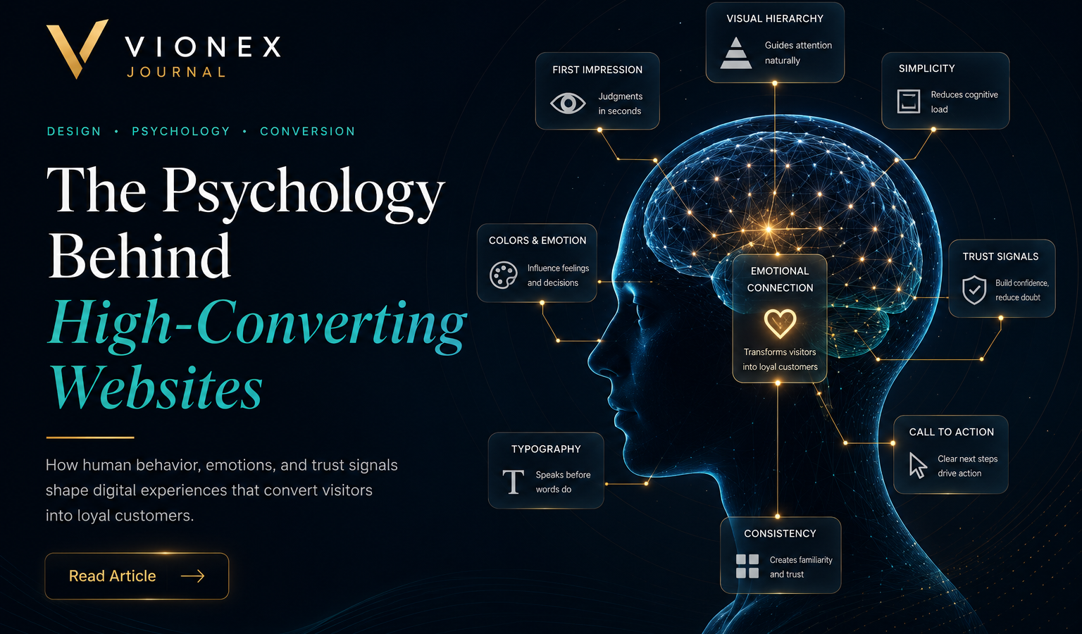
First Impressions Happen Almost Instantly
Research has shown that visitors form an opinion about a website within just a few seconds. During that brief moment, they evaluate whether your business appears professional, trustworthy, and worth their time.
People naturally associate clean, organized interfaces with reliability.
A cluttered website, outdated visuals, or inconsistent branding often creates uncertainty, even if the business itself is excellent.
Premium websites communicate confidence through:
- Clean layouts
- Consistent typography
- High-quality imagery
- Professional color palettes
- Logical spacing
- Balanced visual hierarchy
These elements work together to create a positive emotional response before visitors read a single paragraph.
Visual Hierarchy Guides Attention
Imagine entering a room where every person is speaking at the same volume.
Finding the important conversation would be nearly impossible.
Websites work the same way.
If every headline is large, every button is brightly colored, and every section competes for attention, users become overwhelmed.
Visual hierarchy solves this problem.
A well-designed hierarchy naturally guides visitors through the page by emphasizing what matters most.
Effective hierarchy includes:
- Large, clear headlines
- Supporting subheadings
- Well-defined sections
- Strategic use of white space
- Consistent typography
- Prominent call-to-action buttons
Visitors shouldn’t have to search for important information—it should naturally stand out.
Simplicity Builds Confidence
Many businesses believe that adding more animations, colors, and effects makes a website feel premium.
The opposite is usually true.
Luxury brands often embrace simplicity because it creates clarity.
A clean interface allows visitors to focus on the content rather than being distracted by unnecessary elements.
Simple doesn’t mean boring.
It means every design decision has a purpose.
When unnecessary distractions are removed, users feel more comfortable exploring the website.
Color Influences Emotion
Color plays a significant role in how people perceive brands.
Different colors evoke different emotional responses.
For example:
Blue
- Trust
- Stability
- Professionalism
- Reliability
Gold
- Luxury
- Quality
- Success
- Prestige
White
- Simplicity
- Clarity
- Cleanliness
Black
- Sophistication
- Premium quality
- Elegance
This is one reason why many luxury technology companies use restrained color palettes rather than overwhelming visitors with bright colors.
For Vionex, combining deep black backgrounds with subtle blue and gold accents creates a premium identity that feels modern, elegant, and trustworthy.
Typography Speaks Before Words Do
Typography is often overlooked, yet it has a profound psychological impact.
Visitors subconsciously judge readability, professionalism, and brand quality based on fonts alone.
Premium typography should be:
- Easy to read
- Well-spaced
- Consistent
- Modern
- Appropriate for the brand
Large headings establish authority.
Comfortable line spacing improves readability.
Balanced paragraph widths reduce visual fatigue.
Typography is one of the strongest indicators of design quality.
White Space Reduces Mental Effort
White space is not empty space.
It is breathing room.
When content is tightly packed together, users feel overwhelmed.
Generous spacing allows visitors to process information comfortably.
Benefits include:
- Better readability
- Increased focus
- Improved navigation
- Cleaner appearance
- Stronger premium perception
Luxury brands rarely fill every inch of the screen.
Instead, they allow important content room to stand out naturally.
Trust Signals Influence Decisions
Before taking action, visitors subconsciously ask themselves:
“Can I trust this business?”
Premium websites answer that question visually and strategically.
Common trust signals include:
- Professional branding
- Testimonials
- Client logos
- Portfolio examples
- Secure HTTPS connection
- Contact information
- Clear pricing
- Privacy policy
- High-quality photography
These elements reduce uncertainty and make users feel more comfortable moving forward.
Calls to Action Should Feel Natural
A call to action (CTA) tells visitors what to do next.
Examples include:
- Get Started
- Request a Quote
- Contact Us
- Schedule a Consultation
Poor websites either hide these buttons or overwhelm users with too many choices.
Premium websites strategically place CTAs where visitors naturally expect them.
Good CTA design includes:
- Clear wording
- High contrast
- Appropriate spacing
- Consistent styling
The goal isn’t to pressure users.
It’s to remove uncertainty.
Familiar Navigation Creates Comfort
People enjoy familiar experiences.
That’s why most websites place navigation at the top, logos on the left, and contact buttons in predictable locations.
When navigation follows familiar patterns, visitors don’t need to learn how your website works.
Instead, they focus entirely on your content.
Good navigation is:
- Simple
- Consistent
- Logical
- Easy to scan
The fewer obstacles users encounter, the more likely they are to continue exploring.
Emotional Design Creates Memorable Experiences
People don’t remember every feature.
They remember how your website made them feel.
Premium websites often evoke emotions such as:
- Confidence
- Inspiration
- Excitement
- Curiosity
- Trust
These emotional responses are created through:
- Photography
- Lighting
- Motion
- Color
- Storytelling
- Copywriting
- Layout
When emotion supports usability, visitors develop stronger connections with your brand.
Reducing Friction Increases Conversions
Every unnecessary step reduces the likelihood that users will complete their goal.
Examples of friction include:
- Long forms
- Confusing navigation
- Slow loading
- Too many popups
- Hidden pricing
- Complicated checkout
Premium design removes friction wherever possible.
The easier the experience, the higher the conversion rate.
Consistency Builds Professionalism
Consistency is one of the most overlooked principles in web design.
Buttons should look consistent.
Spacing should remain uniform.
Typography should follow clear rules.
Colors should support your brand identity.
When every page feels connected, visitors perceive the business as organized and reliable.
Inconsistency creates doubt.
Consistency builds confidence.
Frequently Asked Questions
Why is psychology important in web design?
Because websites are designed for people. Understanding how users think helps create experiences that feel intuitive, trustworthy, and engaging.
Does better design always increase conversions?
Better design improves the likelihood of conversions when it aligns with user needs, clear messaging, and business goals. Design alone cannot compensate for a poor product or unclear value proposition.
Can colors really influence customer behavior?
Yes. Colors affect perception and emotion. While cultural differences exist, thoughtful color choices can reinforce your brand’s personality and improve visual communication.
Why do luxury websites often look simple?
Luxury brands emphasize clarity, elegance, and confidence. Minimalist design allows products, messaging, and brand identity to stand out without unnecessary distractions.
What is the biggest psychological mistake businesses make?
Trying to impress visitors with excessive effects instead of making the website easy to understand and use. Simplicity and usability often create a stronger impression than complexity.
Final Thoughts
The most successful websites are not built around trends—they’re built around people.
Understanding how visitors think, what captures their attention, and what builds trust enables businesses to create digital experiences that feel natural and engaging.
Psychology influences every interaction, from the colors users notice first to the ease with which they navigate your pages and decide to take action.
When thoughtful design meets human behavior, websites become more than attractive interfaces. They become powerful tools for building relationships, strengthening credibility, and driving sustainable business growth.
Ready to Create a Website That Inspires Confidence?
At Vionex, we combine psychology, modern design principles, and strategic thinking to craft websites that don’t just look exceptional—they create meaningful user experiences that support long-term business success. Whether you’re building a new website or refining an existing one, our goal is to design digital experiences that turn visitors into loyal customers.
Join the conversation